Page Builder Color Presets

Implementing the CLA VBL colors consistently across all websites can, at times, be a challenge. One thing we've done is to create a Colors documentation page that lists each of the colors in the CLA VBL and provides the color values for each. However, referencing a documentation page each time you need to use a given color isn't as efficient as possible.

On websites that use Page Builder there is the ability to save color presets. To further improve the color presets we've extended Page Builder to automatically add each of the CLA VBL colors to the color presets. The colors will always display in the same order, and at the bottom of the list, leaving custom colors that were manually added to display at the top of the list.

Thankfully, there is nothing that needs to be done on your part to start using the color presets as it's been automatically added to each site using Page Builder.
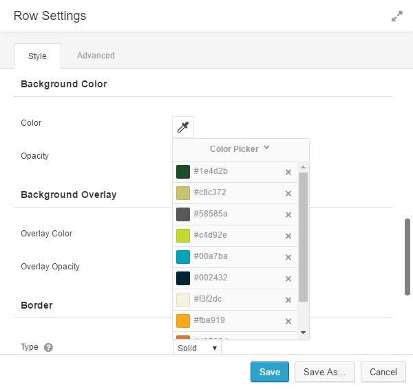
 

Screenshot - color presets

Comments

  1. I am grateful for the informative content you share here. The updated knowledge, detailed explanations, and practical insights make this website an excellent resource. Thank you for consistently offering helpful and well-organized information.

  2. I appreciate the well-written and helpful information published here. The updated knowledge and clear explanations make this website extremely useful. Thank you for offering content that supports learning and understanding.

  3. For anyone collecting ideas for a larger composition, the most useful reference set is often a small group of variations rather than one polished image. Patchwork Tattoos can make that early exploration more concrete by helping compare density, subject combinations, and negative-space options. Bringing those comparisons to a tattoo artist can make the conversation more specific while still leaving room for the artist to adapt the design to anatomy, style, and the existing work on the body.

  4. AI-assisted drafting works best when revision remains an editorial task, not a one-click replacement. A useful workflow should let writers inspect wording, preserve factual claims, and reshape paragraphs for a specific reader. HumanAIEdit fits that practical idea by centering clearer tone, flow, and structure while leaving the resulting article editable. The final review should still check voice, accuracy, and whether each sentence earns its place.

  5. Decorative Unicode text works best when it supports a clear message rather than replacing it. For usernames, bios, and short captions, a readable style is usually more effective than using symbols in every word. A tool such as Letra Cursiva can be useful for comparing a few options, then copying the version that still looks natural on a small screen. It is also sensible to keep a plain-text version of important names or contact details, since display support can vary across apps and devices.

  6. Choosing a document converter is not only about whether it can extract text. It also matters where processing occurs, whether registration is required, and how easily the result can be edited afterward. PDFtoMDConverter describes a browser-local route for text PDFs and clear English scans, producing Markdown that can be refined in a normal editor. That is useful for workflows where the original document should stay under the user’s control. Complex page layouts, tables, and scan quality still deserve a side-by-side check before the converted text is used as a reference.

  7. Login guidance is easier to use when it avoids treating every sign-in failure as a password problem. Readers may need to check the account identifier, verification method, device date and time, network access, or a temporary service interruption. A useful explanation of login issues should make those checks visible in order, while reserving password resets and account recovery for cases where simpler checks do not resolve the problem. This reduces unnecessary account changes and makes support instructions more actionable.

  8. Time boundaries are most effective when they are visible and easy to adjust. A countdown timer with hour, minute, and second controls can support many lightweight routines: a focused writing block, a break, a presentation rehearsal, or a kitchen reminder. Start, pause, resume, and reset controls matter because schedules change mid-task. Keeping these actions in one uncluttered browser screen makes the tool easier to use at the moment it is needed.

  9. Visible emptiness and actual empty input are different things in many digital contexts. A blank-looking character can be useful for controlled formatting, test cases, or fields that need a specific Unicode value, but it should be checked before it is reused. Invisible Text supports that small but important workflow by letting someone create a chosen length, copy it, and test what was produced. The test step helps distinguish a deliberate character sequence from an ordinary space or an accidentally empty field.

  10. Choosing the right dot character is a small editorial decision that can make lists, formulas, and compact interface text easier to scan. A middle dot is not interchangeable with every circular mark: its spacing, intended meaning, and rendering can vary by font and platform. Keeping the character name and Unicode details close to copy options is useful for writers and designers who need consistency across documents. It also helps to preview a symbol in context before using it in public-facing text, especially when alignment and accessibility matter.

Leave a Reply

Your email address will not be published. Required fields are marked *