Summary
Color is used in a variety of ways in web design and content layout, from creating contrast to providing context and additional meaning. While it's a great tool, that should be leveraged, there are some additional considerations that must be considered in regards to those with limited vision or color blindness.
Using Colors
Foreground and Background
One of the most prevalent web accessibility issues is the level of contrast between the foreground (text) and the background (image or color). To certain degree you need to use your own judgement when evaluating specifics, such as text with shadows or text on top of images, but in most cases you can use the Accessibility Checker and follow the guidelines below.
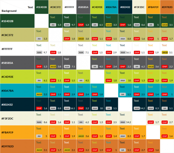
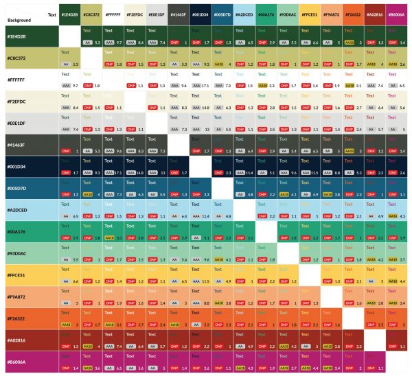
- There must be a contrast ratio of 4.5:1 for normal text and 3:1 for large text, according to WCAG 2.0 Level AA. For a visual example of the passing color combinations, see the diagram below.
- If the contrast issue is for content that is using the default website styles (no custom colors were applied), then please submit a web support request and we will make the necessary adjustments to the default styles.
Color and Meaning
Color can be used to provide context and meaning, however due to color blindness we must follow a few guidelines:
- Don't rely solely on color to convey meaning or context. This applies to things such as graphics or interactive elements where there should be supporting content (text) which provides additional details. An example is a key for a map or graph, using texture or pattern in conjunction with color is necessary.
- When describing an image do not rely on color to describe the content. For example, the man in the red shirt is not a sufficient description.
- Avoid using red and green as contrasting colors.
Color Contrast Charts
CLA 2015 VBL

CLA 2020 VBL
